Every Template Is Now a Step-by-Step Wizard
The Responsive Templates redesign is live: numbered steps with live summaries. You can customize every field where it means something — and the whole template fits on one phone screen.
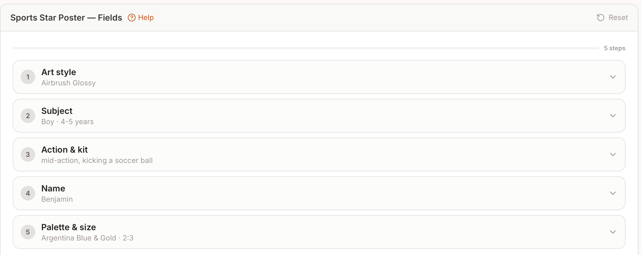
Open any Responsive Template today and you'll notice it feels different. The long wall of options is gone. In its place: a short list of numbered steps — Art style, Subject, Text, Scene, Palette and size — each collapsed until you tap it, each showing a one-line recap of what you've already chosen.
We just finished rebuilding all 95 template editors around one idea: one decision at a time. Here's what changed and how to get the most out of it.
One Decision at a Time
Every template now opens as a step wizard instead of a scrolling form:
1. Numbered steps — usually four to six per template, ordered the way you naturally think: pick the look, describe who's in it, add text, set the scene, choose palette and size.
2. Collapsed by default — only one step is open at a time. Tap a header to open it, tap again to close.
3. Live summaries — every closed step shows what's inside. Character reads "Female · Adult · Caucasian · short cropped hair." You always know what's set without opening anything.
4. Next buttons — finish a step and tap "Next: Scene" to advance. The list scrolls itself to the right place.
On a phone this is the biggest win: the entire template fits on one screen, and nothing you care about is ever buried three scrolls down.
Every Field, Your Way
Presets are starting points, not walls. Two additions make that literal:
- Custom… on every chip row — every preset field now ends with a Custom… chip. Tap it and type exactly what you want: a hometown the list doesn't know, a hobby that's specifically yours, an off-menu accent color. Your text goes straight into the prompt, quoted exactly.
- None where it means something — optional fields now offer a None chip so you can declutter the image: no hat, no held prop, no extra text. Where a field is required (you can't very well have a portrait with no subject), we left it out rather than let you break your own design.
The rule we followed: a preset is a shortcut for a choice you'd make anyway — never a limit on choices you want to make.
Small Changes You'll Notice
- Aspect ratio moved to the end. It used to be the first thing every template asked about. In practice it's the least-changed setting, so it now lives in the final "Palette and size" step, paired with the color palette.
- Fewer always-visible text boxes. Free-text inputs now stay hidden behind their Custom… chip until you actually want to type.
- The star is still the star — after generating, tap the amber star on the image to save it to Your Gallery. Unstarred generations stay in "All generations" so nothing is lost.
How to Get the Best Results
1. Start with a preset close to your idea, then adjust one field at a time. The summaries make it easy to see what you've changed.
2. Use None deliberately — removing an element (scatter, props, extra text) often improves a design more than adding one.
3. Branch fearlessly — flip back to an earlier step, change the style, and keep going. Every step's summary updates the moment you change it.
Try One
Open the [Responsive Templates](/blueprint) gallery and pick any template — the Silly Goose Sticker is a fun two-minute tour: choose your dancer (a sheep gets woolly curls and hooves, not a beak), pick the boots and umbrella, type any two words, and generate. Ninety-four more are built the same way.
Ready to try it yourself?
Start creating professional AI designs in minutes — no experience required.
Get Started Free